5 keys to graphic packaging design (with video!)
I always mistrusted magic lists and thanks to an article by Leo Piccioli I ended up understanding why.
I didn’t want to force five keys of this video because I could use my hand to enumerate them. These are just the aspects that seem most important to me for any graphic packaging project.
That’s how I created my first video for FOROALFA.
1- To be someone for someone
Find out who it is aimed at and think of a special person, real or invented. Describe her tastes, her universe and the graphic style that surrounds her.
It doesn’t mean that the package is going to interest only that person. She represents a whole mass that has the same interests. If you don’t think about one person in particular, the design may be too generic and, finally, it won’t be relevant to anyone.
It’s better to be somebody for one than nobody for all.
2. The chromatic environment
Identify the color of the category that acts as a shortcut to communicate the type of product. Keep this in mind so as not to confuse the consumer.
Recognize the brand colors of the competition to verify if you could use any of those or if there is any opportunity for differentiation.
Watch out for variety colors! Orange juice is identified with the color orange. It is difficult to establish a new color to communicate this variety.
In order to differentiate oneself, it is necessary to find a way to merge the known and the innovative.
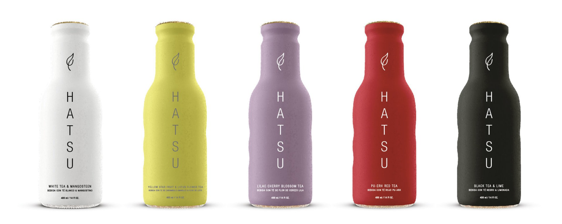
In Hatsu teas, the brand color is neutral so as not to interfere with the variety color that is the star of the design. An innovative color strategy for the category.
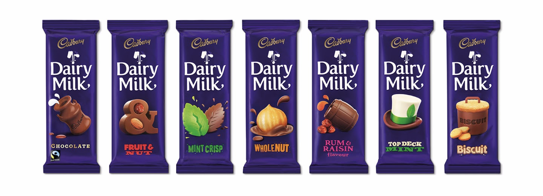
Cadbury generates a strong consistent brand color block and uses a lesser proportion of variety color to avoid buying something you didn’t want.
3. Graphic architecture
The graphic architecture of the packaging consists mainly of three elements: brand, variety and key visual.
BRAND
The brand, graphic brand, logo or whatever you want to call it has a typographic style that sets the tone of communication of a brand.
The important thing is to think what you want to convey the style of the brand and use color to complement it.
DESCRIPTOR
In most cases there is a denomination that has to have a complementary graphic style to the brand.
If both have the same treatment there is a competition of personalities and it is not known who is in charge.
It’s always the brand that rules.
KEY VISUAL
The key visual can be the graphic brand, as in the case of Coca-Cola or the descriptor, as in 70% pure cocoa chocolates.
In many cases it is a literal image, like the photo of an orange, but it is more interesting when it is symbolic because it adds one or more layers to meanings. In other cases the key viusal refers to the origin, the situation in consumption or is abstract.
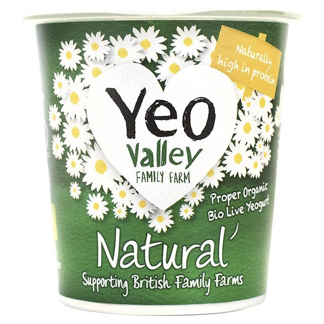
These three elements can also be interspersed as in the Yeo Valley yogurt where the brand is integrated to the key image and below predsenta the descriptor.
4. Package Structure
Although it is not possible to change the packaging structure, a visual route can be generated with the continuity of the design around the packaging.
In transparent containers, windows can be used with creative shapes that allow the product to be seen inside.
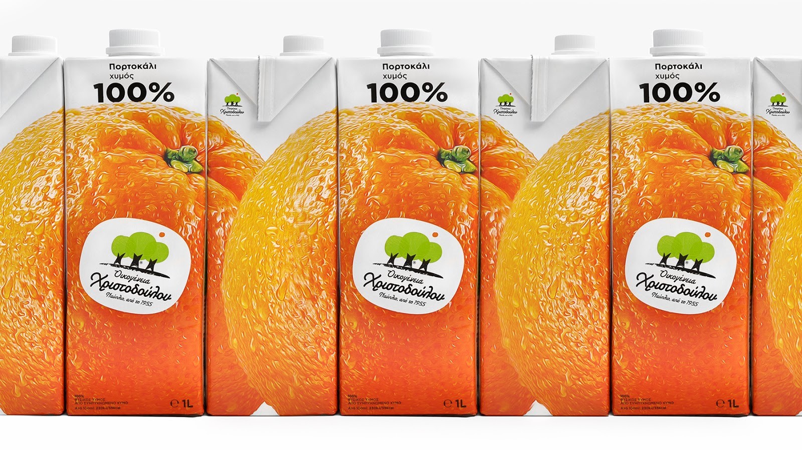
Think about using graphic resources when one product is exhibited next to the other to generate the sensation of continuity between them. This increases the sensation of brand block.
5. The first impression
It is essential to know how it will be printed from the beginning of the project.
Flexography is the system used to print plastic bags and corrugated boxes using flexible polymers.
The rotogravure, widely used for doypacks and other flexible, prints with metal cylinders which makes the input much more expensive but are more durable, there is also Offset, one of the most popular printing systems in the industry to print cartons on cardboard, such as cereal boxes.
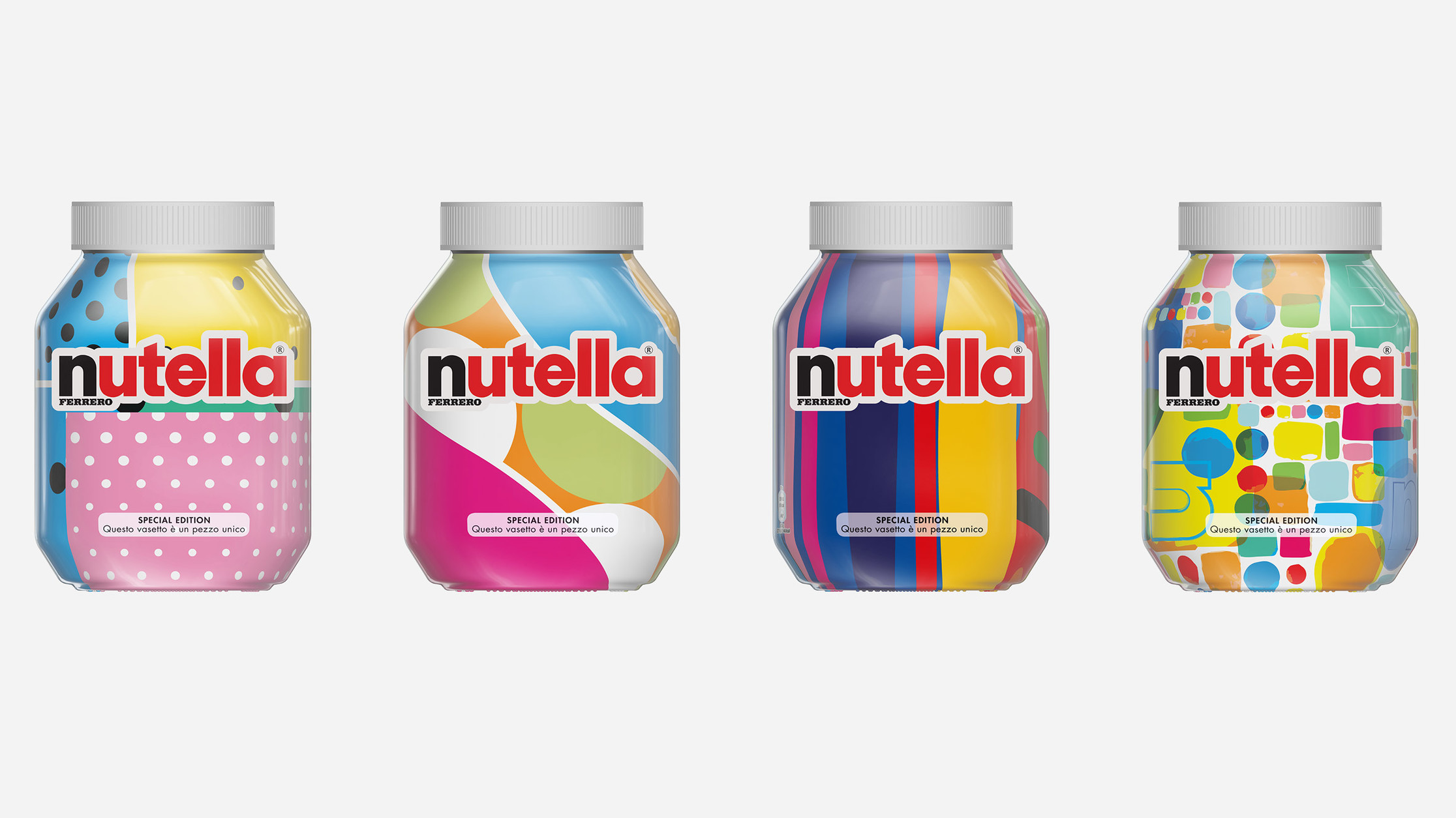
What is growing a lot is digital printing because it allows changes in small quantities without polymers or metal cylinders. Several brands campaigned in this way, Nutella was one of them.
It is advisable to consult with the printer what their requirements are and make a pre-delivery, send a preview and listen to comments.
The 5 keys
To finish I leave you a summary of the 5 critical stages of packaging design:
- Think of someone and design for that person.
- Recognize the colors of the category, brands and varieties
- Use the brand, descriptor and key visual with criteria.
- Take advantage of the visual route of the container.
- Consult the technical specifications and make a pre-delivery.