Gond Wana: a million year old secret locked in a bottle
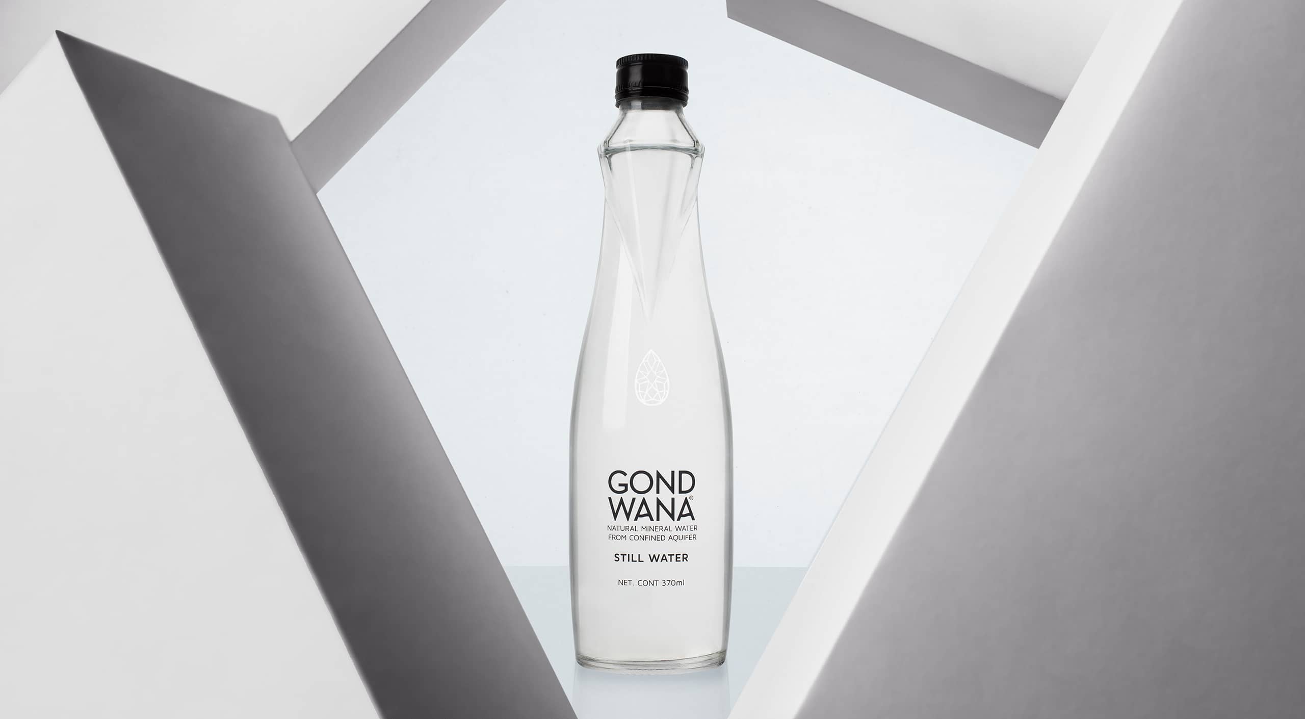
More than water is a jewel, we were told. One might think that someone in love with his product might exaggerate a bit. But they were right.
We had to design the bottle and the graphics for a premium, exclusive water. It comes from a secret kept in the heart of nature. It’s a water that was there, intact, purest for millions of years.
The name was already chosen. Gond Wana was the name of one of the two mega-continents when the earth broke in two millions of years ago.
The aquifer that kept this water hidden is located in South America, in Itacurubí de la Cordillera, Paraguay.
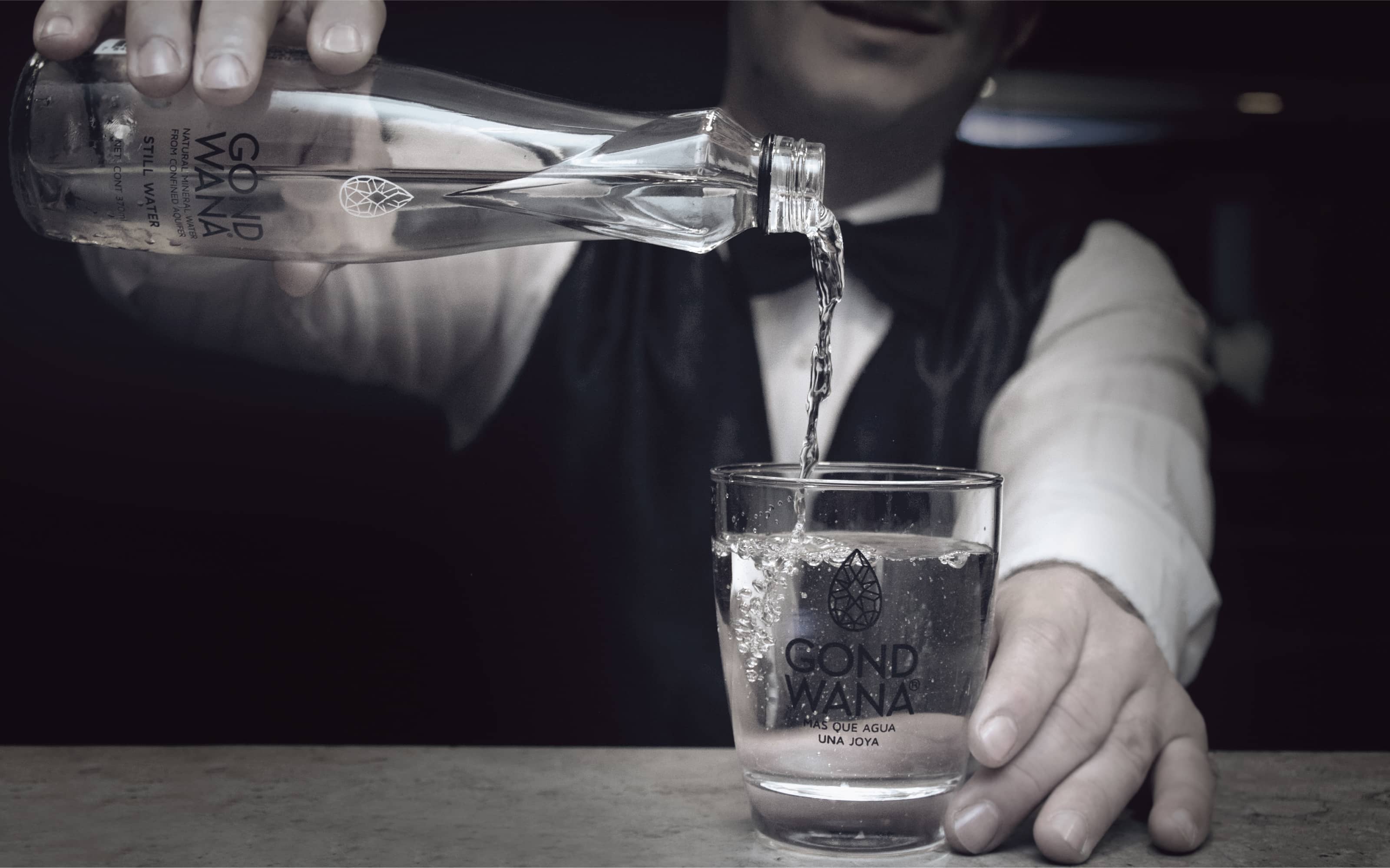
The aquifer was discovered through hard research. The quality of the water was taken care of by nature: millions of years filtering through the pores of the rocks that contain 99% of pure and transparent crystalline quartz grains.
But not only is its origin surprising. Gond Wana has a combination of bicarbonate, potassium and calcium in a 100% natural way that provides unparalleled benefits to the body.
It was only necessary to bring out its origin by means of packaging design.
Every brand must have something interesting to tell.
More than water is a jewel, we were told. Why did they say that? That phrase is used to say that one thing or one person has something different, something that is not easy to find.
A jewel is an object made of precious stones, which is related to the origin of Gond Wana water from the geological and symbolic point of view .
We knew we had to do something to bring that concept to the bottle design and graphics in a dazzling way in order to create a premium brand
Premium brands should look premium, not say it.
Premium is felt, not read. It’s what conveys the prestige of design. Brands with high quality perception convey high self-esteem. They show little but enough to captivate.
Brands must always add value: be it symbolic, by reputation, by relationship, by experience, by distinction or by exclusivity.
Like jewellery, which is unique because of the use of hard-to-find materials and the enormous work involved in carving it.
It was precisely the characteristic shapes of the carved gemstones that were the key to the design of the bottle and the graphics.
And how do we make the bottle look like a gemstone? Shall we insert a diamond in it? That would be too expensive.
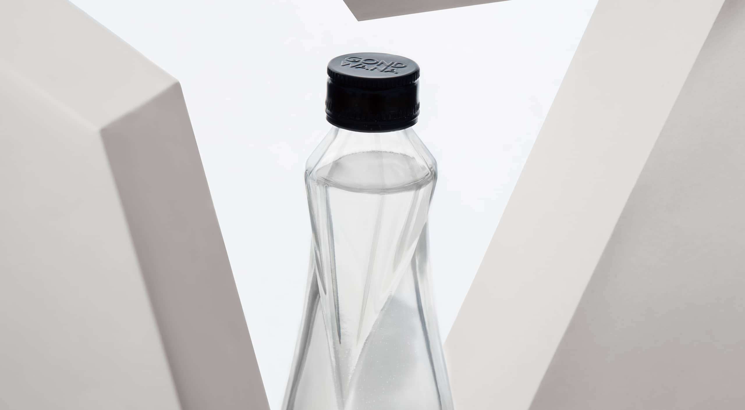
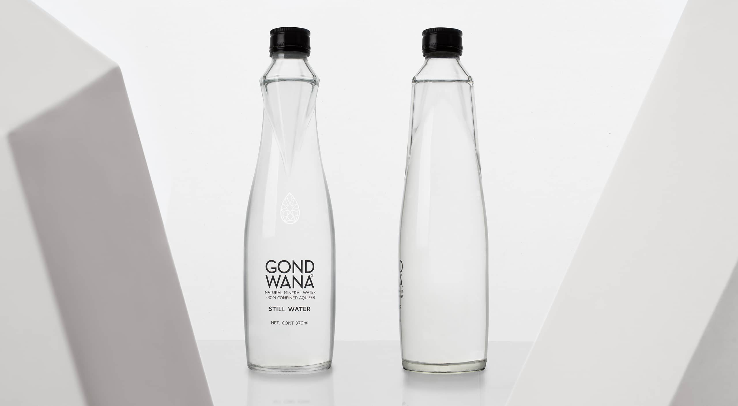
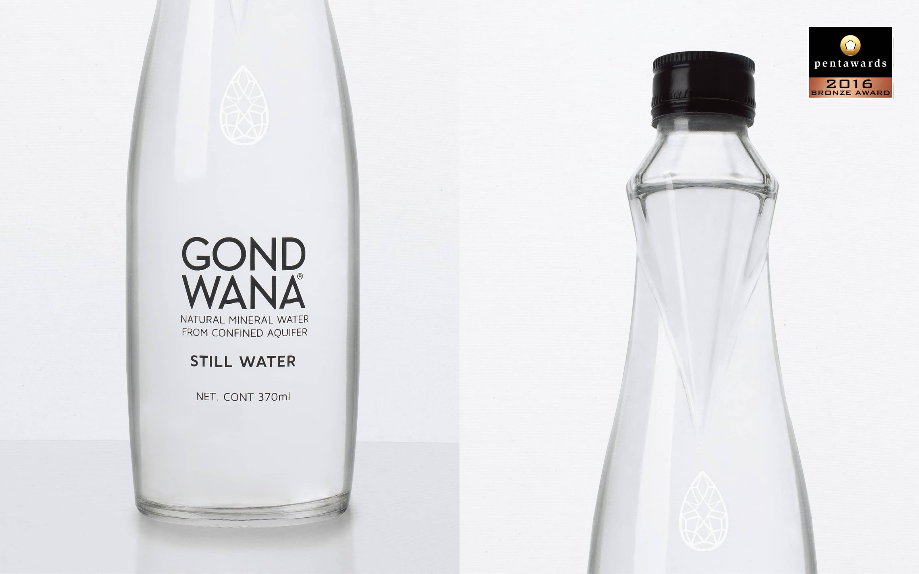
We designed a stylish glass bottle that proudly has a faceted shape on its neck reminiscent of diamonds. Taking care that these angular prismatic shapes are comfortable when in contact with the hand.
The experience provided by a bottle has to be wonderful both to the eye and to the touch.
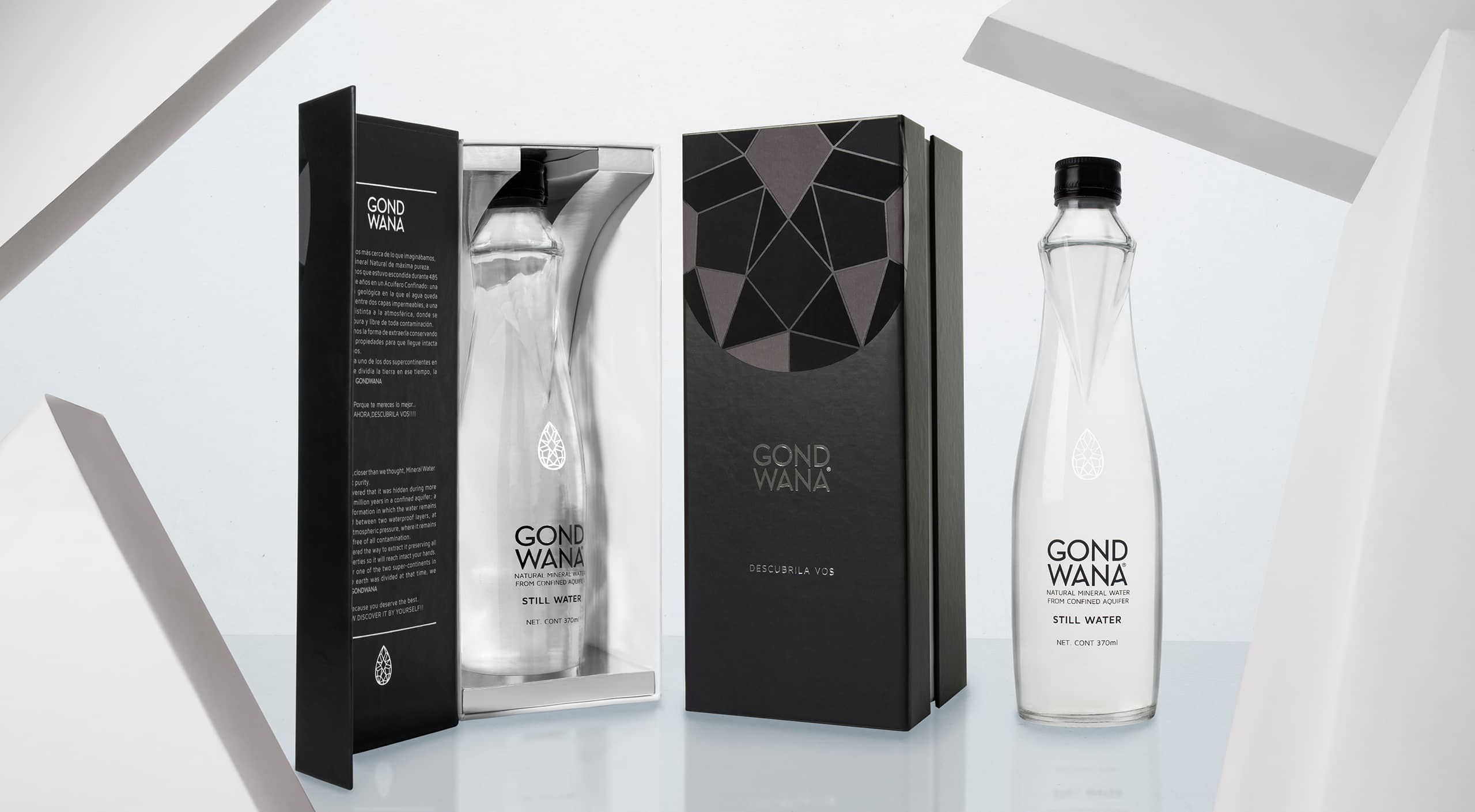
With regard to graphics, we opted for a subtle but forceful resolution. Which graphic element represents the purity of the water? A drop! But a drop is not a jewel. To link it to the concept of the bottle we designed a fine geometric pattern that reinforces the idea that this drop is a carved precious stone.
The case of the product serves as a luxury dress to present it in society in a spectacular way.
Did you know that jewelry was an element of power? The kings had gold crowns covered with precious stones to demonstrate their superiority over the rest of the human beings.
Unlike the royal era, today’s premium market is massive and is not reserved only for social and economic elites.
The premium market has become more democratic.
There are people who are willing to pay more for exclusive products that symbolize their interests or the experience that makes them live.
There is nothing like having the satisfaction of doing the right thing. But it is better it is when it is recognized by specialists.
Gond Wana won aGold A´Design Award and a Pentaward in recognition of his structural and graphic packaging design.
It also received two gold stars in the Superior Taste Award 2017, in a blind tasting evaluation with a score of over 80%.
More than water a jewel, we were told. And they were right.
Nada como tener la satisfacción de estar haciendo lo correcto. Pero cuanto mejor cuando lo reconocen especialistas.
Gond Wana ganó un Gold A´Design Award y un Pentaward en reconocimiento a su diseño estructural y gráfico de packaging.
También recibió dos estrellas de oro en Superior Taste Award 2017, en una evaluación de cata a ciegas con una puntuación de más de 80%.
Más que agua es una joya nos dijeron. Y tenían razón.